

The Biggest Interior Design Mistakes We See Again and Again (And How to Avoid Them)
Updated: May 1
There’s a moment that happens in almost every home design project.
Everything looks good individually—the sofa is expensive, the lighting is stylish, the colors are trendy—but when you step back, something feels… off. The space doesn’t come together. It doesn’t feel right.
After working on hundreds of interior visualizations and real-world layouts, we’ve noticed a pattern. Most design failures don’t happen because people lack taste—they happen because of a few fundamental mistakes that quietly ruin the entire space.
This article isn’t just a list of tips. It’s a deep breakdown of what actually goes wrong in interiors—and how to fix it properly, like a professional.

It Almost Always Starts With No Clear Plan
One of the biggest issues we see is people jumping into design without a defined direction. They start buying furniture, choosing finishes, experimenting with colors—all without a cohesive vision.
Individually, each decision may seem fine. But together, they rarely work.
A well-designed interior isn’t built piece by piece randomly. It’s built on a clear concept. Whether it’s modern minimal, luxury contemporary, or warm natural—everything flows from that starting point.
Studios like Dimension Rendering Studios consistently emphasize this because it’s where most projects either succeed or fail.
When you define your direction early—through references, mood boards, or even rough sketches—you eliminate confusion later. You stop guessing. And your space starts to feel intentional instead of accidental.
Scale Is the Silent Killer of Good Design
If something feels wrong in a room but you can’t explain why, it’s often a scale issue.
A sofa that’s slightly too large. A rug that’s just a bit too small. A coffee table that visually disappears. These aren’t dramatic mistakes—but together, they completely disrupt the balance of a space.

Good design relies heavily on proportion. Not perfect symmetry—but visual harmony.
We’ve seen beautifully designed rooms ruined by a rug that was chosen two sizes smaller than it should be. It instantly shrinks the space, no matter how premium everything else is.
Professional designers don’t guess scale—they calculate it. They measure. They visualize spacing before anything is purchased.
Once you start paying attention to scale, your spaces immediately begin to feel more refined and “put together.”
Lighting Isn’t Just Important—It’s Everything
People often treat lighting as something to decide later. In reality, it should be one of the first things you think about.
A poorly lit room will never look premium—no matter how expensive the materials are.
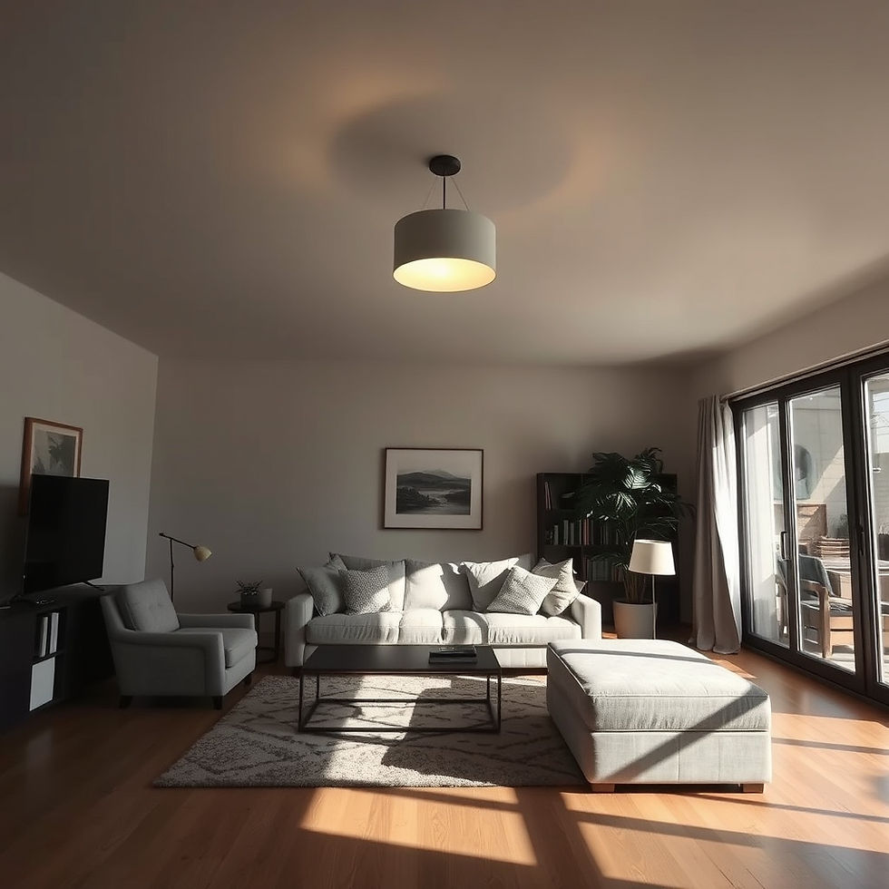
We’ve seen stunning interiors fall completely flat simply because they relied on a single ceiling light. It creates harsh shadows, uneven brightness, and a lifeless atmosphere.
Good lighting works in layers. There’s a base level that illuminates the room, then focused lighting for specific tasks, and finally softer accent lighting that adds depth and mood.
Design authorities like Architectural Digest have repeatedly highlighted how lighting alone can transform the perceived quality of a space.
And once you experience well-layered lighting, it’s hard to go back.
Trends Are Tempting—But They Expire Quickly
There’s always something trending. A new color palette, a new texture, a new “must-have” look. The problem is, trends are designed to change.
If your entire interior is built around what’s currently popular, it’s almost guaranteed to feel outdated within a couple of years. That doesn’t mean you should avoid trends completely. It just means you need to use them intelligently.
The foundation of your home—your furniture, layout, finishes—should remain timeless. Trends should come in through elements that are easy to change: cushions, décor, artwork, accessories.
That way, your space evolves without needing a complete redesign every few years.
Layout Mistakes Are More Common Than You Think
A room can have perfect furniture, perfect colors, perfect lighting—and still fail because of layout.
I’ve seen living rooms where movement feels awkward, where people have to walk around furniture unnaturally, where spaces feel cramped despite being large.

This usually comes down to one thing: lack of planning for how the space will actually be used.
Design isn’t just about how something looks. It’s about how it works.
You should be able to move naturally through a room. Conversations should feel comfortable. Every piece should have a purpose. When layout is done right, you don’t notice it. But when it’s wrong, you feel it immediately.
The “Everything Against the Wall” Habit
This is one of the most common mistakes—and one of the easiest to fix.
People assume pushing all furniture against walls makes a room feel bigger. In reality, it often does the opposite. It flattens the space and removes any sense of depth.
When furniture is slightly pulled inward, something interesting happens. The room starts to feel more intentional. More structured. More inviting.
You create zones—areas for conversation, relaxation, movement.
This is something platforms like Houzz frequently highlight in their design recommendations, and for good reason—it works.
When Everything Matches, Nothing Stands Out
Perfectly matching furniture sets might seem like a safe choice, but they often result in spaces that feel lifeless.
Real interiors—the kind that feel rich and layered—are built through contrast.

Different materials. Slight variations in color. A mix of textures.
That’s what creates depth.
When everything matches too perfectly, the space loses personality. It feels more like a showroom than a home.
Color Mistakes Are Subtle but Powerful
Color is one of the most misunderstood elements in interior design.
Too much white can make a space feel cold and unfinished. Too many bold colors can make it among greatest Interior Design Mistakes.
But the real issue isn’t usually the color itself—it’s how it’s used.
Good interiors have a clear color story. There’s a base palette, supported by secondary tones, with occasional accents that add interest.
And most importantly, there’s continuity. One room flows into the next without abrupt changes. That’s what creates a sense of harmony throughout the home.
Most People Ignore Vertical Space Completely
Design doesn’t stop at eye level.
Walls, ceiling height, curtain placement—these all play a major role in how a space feels.
Curtains hung too low can visually shrink a room. Empty walls can make a space feel incomplete.
When you start using vertical space properly—taller elements, better proportions, thoughtful wall design—the entire room feels more expansive.
Comfort Should Never Be Compromised
This is something we see surprisingly often—spaces that look incredible in photos but feel uncomfortable in real life.
A sofa that looks sleek but isn’t pleasant to sit on. Chairs that are visually striking but impractical.
Design should enhance your life, not complicate it. The best spaces are the ones that feel as good as they look.
Clutter Is Not Just Physical—It’s a major among Interior Design Mistakes
Even if a room isn’t physically crowded, it can still feel cluttered.

Too many materials. Too many colors. Too many elements competing for attention.
Good design includes restraint.
Negative space—areas where nothing is happening—is just as important as the elements you add.
It gives the eye a place to rest. It allows the design to breathe.
Functionality Is Where Design Proves Itself
A beautiful kitchen that’s difficult to use will quickly become frustrating. A bedroom without proper storage will never feel calm.
This is where design becomes real.
Every space should be built around how it will be used daily. Storage, accessibility, convenience—these aren’t secondary considerations. They’re core to good design.
Smaller Spaces Amplify Every Mistake
In compact homes or apartments, every decision matters more.
A slightly oversized piece of furniture can dominate the entire room. Poor storage planning can lead to immediate clutter. But when designed correctly, small spaces can feel incredibly efficient and even luxurious.
The key is to be intentional—multifunctional furniture, lighter palettes, smarter layouts.
What Actually Makes a Space Feel “Professionally Designed”
After everything we’ve seen, it usually comes down to a few simple things:
The space feels balanced.
Nothing feels out of place.
Movement feels natural.
Lighting enhances everything.
And most importantly—it feels effortless.
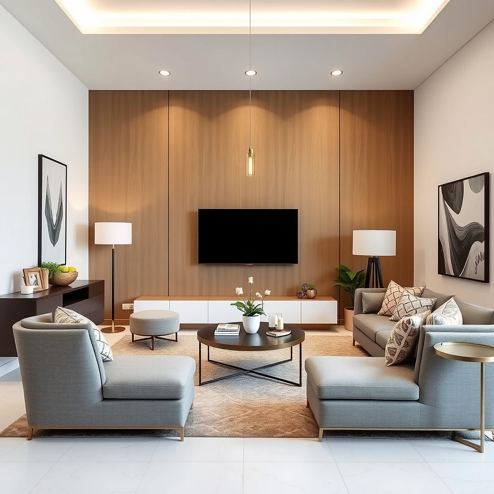
That “effortless” feeling is never accidental. It’s the result of careful planning and avoiding the mistakes most people don’t even realize they’re making.
Final Thought
Interior design isn’t about copying what looks good online.
It’s about understanding what works—and why.
When you avoid these common mistakes, your space doesn’t just look better. It feels better. It functions better. It lasts longer. And that’s ultimately what great design is about.


Comments